Blog
Complete Guide to Data Selection & Chart Editing
 Mike Yi · Jan 20, 2026
Have you ever tried to make a graph in Excel for an executive report, only to find that selecting a column chart included the total row and distorted your visualization? Or discovered that your legend displays "Series1, Series2" instead of meaningful names?
Learning how to create a chart in Excel requires understanding the complete workflow, from data range selection to chart type selection and editing, to avoid common mistakes.
This guide walks you through the entire process step by step, from creating your first Excel graph to using chart styles and editing features.

Selecting Data Range Before Creating an Excel Chart
Excel charts are built from the data range you select. The most critical first step when learning how to create a chart in Excel is accurate range selection. Incorrect range selection can include unnecessary data or omit essential information.
Data Range Selection Methods
Data suitable for Excel graphs has a table structure with field names (Month, Sales, Costs) in the first row and actual data in the rows below. For contiguous data, click the first cell (A1) and drag to the last cell (C13), or use Ctrl+Shift+Down Arrow to select to the end.
For non-contiguous ranges, drag A1:A13, then hold Ctrl while selecting C1:C13. This allows you to make a graph in Excel using only the columns you want.
Excel Chart Types and Selection Criteria
Choosing the wrong chart type can fail to communicate your data's meaning effectively. Understanding each chart type's characteristics and matching them to your data is essential for Excel visualization success.
Chart Type Characteristics and Selection Criteria
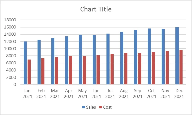
Column charts compare values across categories and work well for monthly sales or departmental performance comparisons. Bar charts are useful when category names are long. Line charts show changes over time and suit continuous time-series data like monthly sales trends. Pie charts display proportions of a whole but become difficult to read when you have more than 5 items, so use them sparingly.
Using the Recommended Charts Feature
The Recommended Charts feature in Excel's Insert tab automatically suggests charts suited to your selected data. When you're unsure which chart to create in Excel, click Recommended Charts in the Insert tab to preview and compare multiple options for better data visualization.
Step-by-Step Guide: How to Create a Chart in Excel
Once you've determined your data range and chart type, it's time to create your graph. Using the Charts group in the Insert tab, you can complete the process with just a few clicks to make a graph in Excel.
Creating a Basic Chart Using the Insert Tab
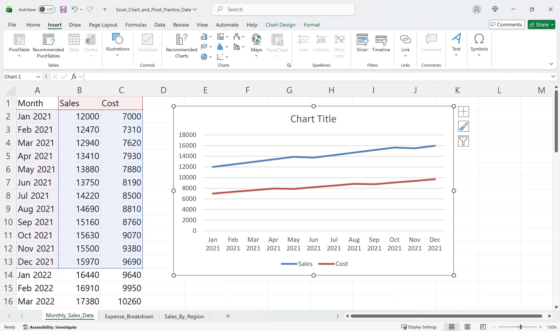
- Drag to select the data range for your chart (e.g., A1:C13).
- Click the Insert tab in the ribbon menu.
- Select the desired chart icon in the Charts group (Column, Line, Pie).
- Choose a specific subtype from the dropdown menu, such as Clustered Column or Stacked Column.
- Click to automatically generate the Excel chart on your worksheet.
Creating Charts Quickly with Recommended Charts
- Select your data range, then click the Recommended Charts button in the Insert tab.
- The Recommended Charts window displays multiple chart types with previews on the left.
- Click each chart to see a larger preview on the right.
- Select your preferred chart and click OK to complete creating your Excel graph.
Adjusting Chart Position and Size
The generated Excel graph appears as a floating object on your worksheet. Drag the chart border to move it to your desired location, and drag the corner handles to resize it. Hold Shift while dragging a corner to maintain the aspect ratio.
Changing Chart Design Quickly with Excel Formatting
Once your basic chart is created, you can use Excel formatting features to change colors, layouts, and styles for a cleaner, more professional appearance. Excel charting tools provide predefined templates to speed up your workflow.
Applying Quick Layouts and Styles
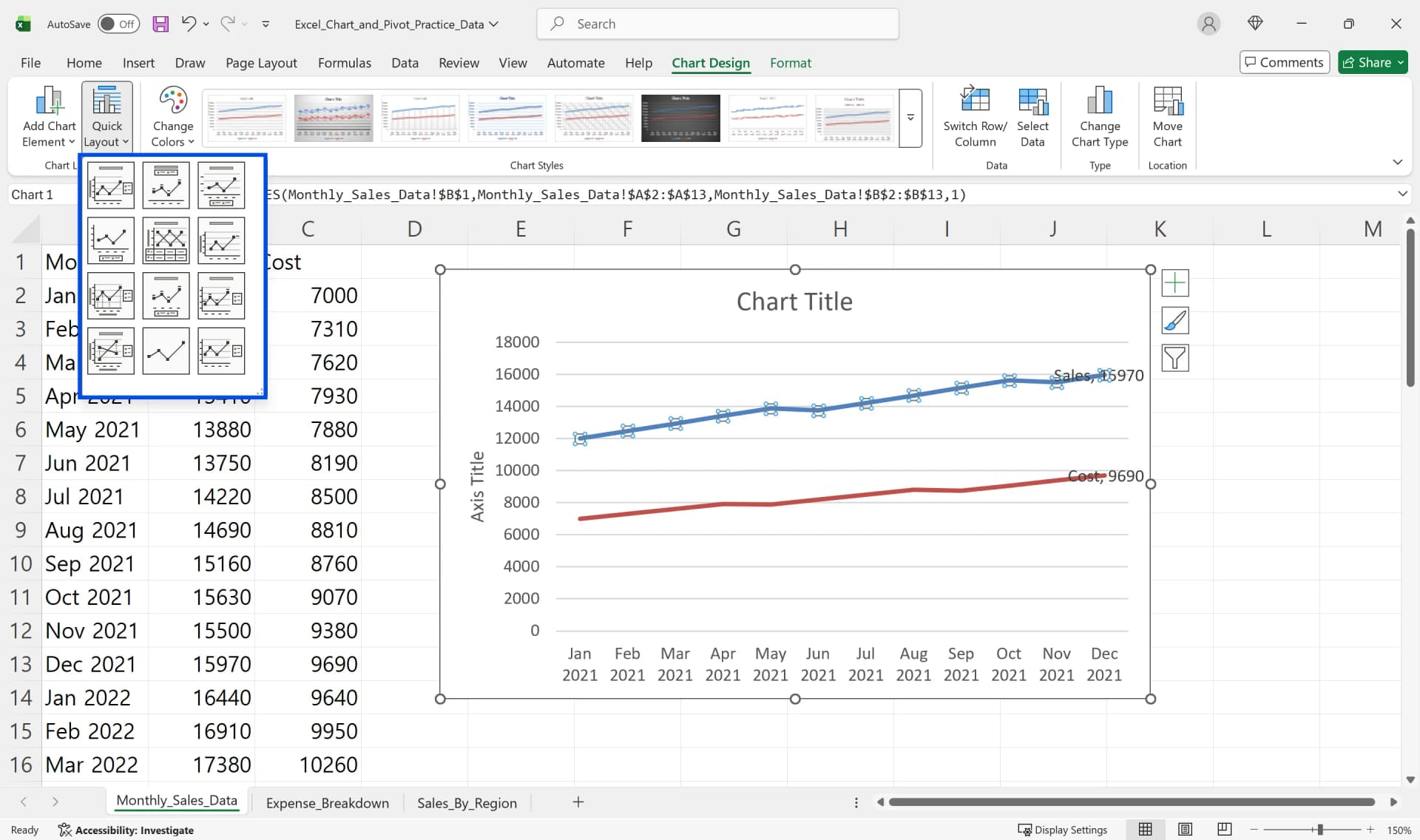
- Click your chart to display the Chart Design tab in the ribbon.
- Select a predefined style from the Chart Styles gallery.
- Click the Quick Layout button to adjust the position of titles, legends, and data labels.
- Choose a color theme to apply consistent formatting instantly.
Using these built-in layout and style options saves time and keeps your Excel chart visually consistent.
Changing Chart Type
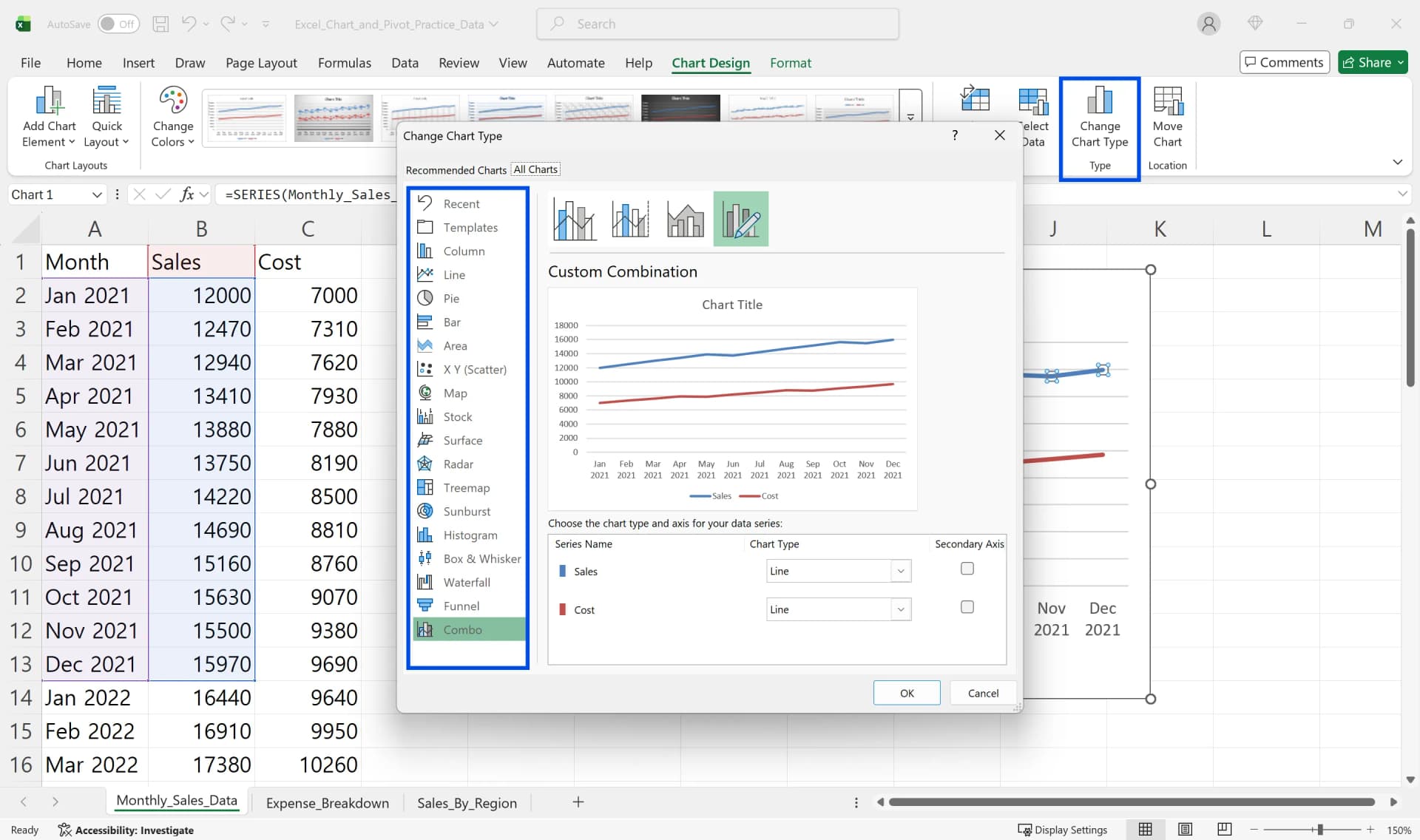
- To change the type of an existing Excel graph, click the Change Chart Type button in the Chart Design tab.
- Select a new chart type in the Change Chart Type window.
- Choose a subtype on the right and click OK to change the chart appearance while preserving your data.
How to Edit Charts in Excel: Change Axis, Titles, and Legends
The core of editing Excel charts is properly configuring titles, legends, and axes. These three elements are essential for data comprehension and should be checked first when you edit charts in Excel.
Adding and Modifying Chart Titles
- Select your chart to display three buttons (+, paintbrush, filter) in the upper right.
- In the Chart Elements (+) button, check Chart Title to create a text box above your Excel chart.
- Click the text box and enter your desired title (e.g., 'Monthly Sales Trend').
- With the title selected, you can change size, color, and bold formatting in the Font group on the Home tab.
Displaying Units with Axis Titles
- Check Axis Titles in the Chart Elements (+) button.
- Text boxes appear on the horizontal and vertical axes.
- Enter axis names with units in the vertical axis title, such as 'Sales ($1000s)'.
- When you edit charts in Excel, clearly marking units helps readers accurately understand the scale of values. Learning how to change chart axis Excel labels is crucial for professional presentations.
Changing Legend Position and Names
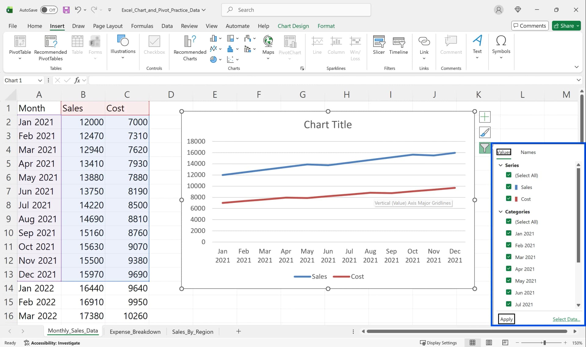
- Click the arrow to the right of the Legend item in the Chart Elements (+) button.
- Select your desired position: Right, Top, Bottom, or Left.
- Legend names come from the column headers in your source data, so modifying the first row of your original table (B1, C1, etc.) automatically updates the Excel chart legend.
Displaying Values with Data Labels
Check Data Labels in the Chart Elements (+) button to display actual numeric values above each bar or line. When you need to emphasize exact values in reports, adding this when you edit charts in Excel is helpful.
Modifying and Managing Excel Graph Data Ranges
After creating a chart, you often need to add or change data ranges. Using the Select Data feature lets you adjust ranges without recreating your Excel graph.
Adding and Removing Data Series
- Select your Excel chart, then click the Select Data button in the Chart Design tab.
- When the Select Data Source window opens, the left side shows a list of currently included series.
- To add a series, click Add and specify the series name and value range.
- To remove unnecessary series, select the series and click Remove.
Moving and Copying Charts
To move an Excel graph to another worksheet, select the chart and press Ctrl+X to cut, then Ctrl+V to paste on the destination sheet. You can also use the Move Chart button in the Chart Design tab to select a new sheet or existing sheet.
Common Mistakes When Learning How to Create a Chart in Excel
Knowing common mistakes that occur when first learning how to make a graph in Excel helps reduce trial and error. Most beginner mistakes happen during data range selection and chart type selection.
Including Total Rows in Charts
If your source data has a total in the last row, exclude it when selecting your range. Including the total row causes the total value to display much larger than other items in your Excel graph, distorting the overall proportions.
Missing Header Rows Causing Legend Errors
If you don't include the first row (header row) in your data range, Excel assigns arbitrary names like "Series1, Series2." When you create a chart in Excel, always start your selection from the first row with field names to ensure legends and axis labels display correctly.
Too Many Items in Pie Charts
Pie charts work best with 5 or fewer items. Creating a pie chart with 10 or more items makes each slice small and difficult to compare proportions. When you have many items, using a column or bar chart is more effective for Excel visualization.
3D Effects and Excessive Decoration
3D charts look visually impressive but make it difficult to accurately read values due to perspective angles. For professional reports, use simple, clear 2D Excel graphs.
How to Create a Chart in Excel: Frequently Asked Questions
Q. My chart shows 'Series1, Series2' in the legend. How do I change it?
Legend names come from the first row of your source data. Enter desired names like 'Sales' and 'Costs' in your original table's column headers (e.g., B1, C1 cells), and your Excel chart legend will update automatically.
Q. I added data but it's not reflected in my chart.
Excel graphs only reference the range specified when created, so adding new rows doesn't automatically expand the range. Convert your source data to a table format using Ctrl+T, and the chart range will automatically expand when you add rows or columns.
Q. How do I save a chart as an image file?
Right-click your Excel chart and select "Save as Picture" to save it as a PNG or JPEG file.
Q. My vertical axis scale is too large or small.
Double-click the vertical axis to open the Format Axis task pane. When you need to change chart axis Excel settings for better readability, adjust minimum, maximum, and major unit values in the Axis Options. Modifying these settings to match your data range makes your Excel graph clearer and more professional.

Work More Efficiently in Excel with Cicely AI
Creating and editing charts in Excel often requires repeated adjustments. You may need to refine data ranges, update axis scales, rename legends, or switch chart types before the final result looks right.
Cicely AI is a desktop-native AI coworker built for spreadsheet workflows. Instead of navigating multiple menus manually, you can describe what you need in plain English, such as:
"Create a line chart using monthly sales data."
"Exclude the total row from this chart."
"Move the legend to the bottom and adjust the vertical axis scale."
Cicely reviews your worksheet structure and guides you through the correct setup step by step. Everything runs locally on your PC. No file uploads. No browser tools.